The Client
Providing surety and excess liability coverage, this specialty insurance company supports the natural resources sector with expertise, reliability, and a commitment to responsible growth.
Indemnity National is a specialty insurance company focused on providing surety and excess liability coverage to the natural resources industry. Headquartered in Franklin, Tennessee, they support sectors like mining, energy, and infrastructure across 49 states. With an A rating from AM Best and a deep commitment to environmental responsibility and economic impact, their work strengthens the backbone industries that keep the country running.
The Challenge
An outdated look that lacked presence and clarity
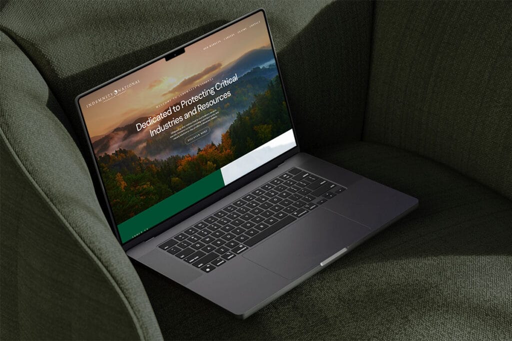
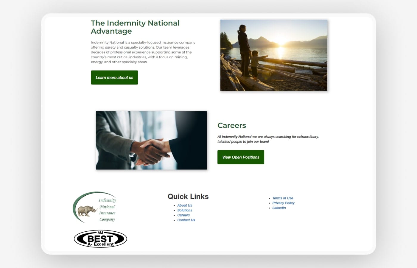
Indemnity National’s previous website felt dated and visually flat. The design failed to capture the scale, credibility, and importance of the industries they serve. Nothing stood out, and the experience lacked the visual and functional clarity that today’s users expect. The site needed a complete refresh to bring the brand into the present and reflect the strength and purpose behind their work.
The Direction
Slow, elegant, and grounded in purpose
The redesign takes a thoughtful approach, balancing sophistication with clarity. A clean layout supports intuitive navigation while rich greens are paired with neutral tones to convey trust and professionalism. Subtle topographic textures were introduced in the background to reflect Indemnity National’s deep connection to land and industry. The typography mixes modern sans serif for readability with elegant serif accents to highlight key moments. Animations are paced gently with soft blur and fade-in effects, allowing content to unfold smoothly. Every element works together to create a calm, confident experience that mirrors the company’s strength and integrity.


The Result
A confident presence shaped by clarity and care
The finished site feels modern, steady, and built with intention. Its polished layout and restrained use of motion allow the content to lead, while design choices like soft transitions and layered typography add refinement without distraction. Users now experience a digital presence that reflects Indemnity National’s professionalism and focus, with information that’s easier to access and a look that feels aligned with their role in protecting critical industries. The redesign brings lasting clarity to a brand rooted in trust and purpose.